

The FEP (V2)
JUL 2024
BRAND
DESIGN
SITE
Overview
The Family Eagles Pool (FEP) website is a personal project that I originally built to teach myself Framer. After using the site for a full season, I decided to revamp it to simplify the user experience, integrate new Framer updates, and streamline the back-end processes.
Accomplishments
Revamped the FEP website with a simpler, cleaner design that improved user experience by making all key components easily accessible.
Streamlined the back-end process by integrating a new CMS and purchasing an advanced chart component, significantly reducing the manual workload.
Responsibilities
I took it upon myself to redesign and rebuild the FEP website to make it simpler, cleaner, and more user-friendly. I did 100% of the work myself.
Process
The first version of the FEP site, while a great learning experience, had several shortcomings, including a manual process for updating the chart component and a less-than-robust CMS. My goal for the revamp was to simplify the design, reduce friction for users, and make the site easier to maintain.
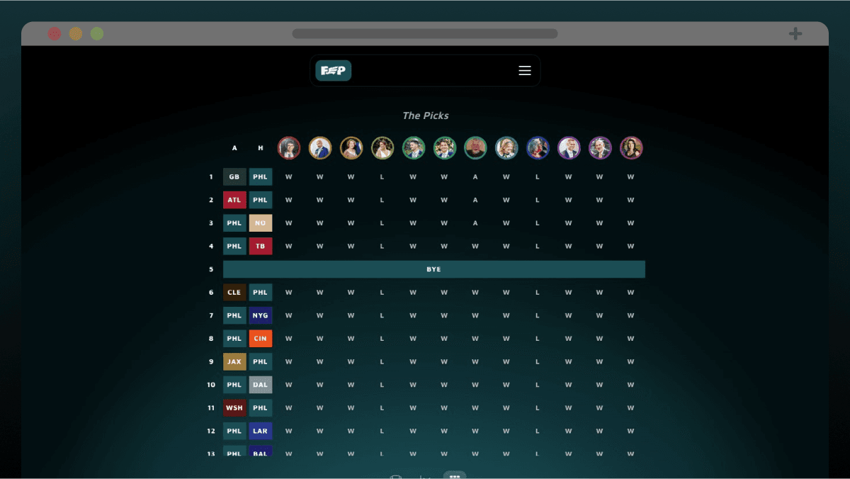
I started by simplifying the site's layout, ensuring that all key information—standings, charts, and picks—was visible within the viewport and accessible with a single click. This change made the site more intuitive and user-friendly, allowing competitors to check their standings quickly each week. As a bonus, I played around with Framer's 3D effects update to add some more visual appeal.

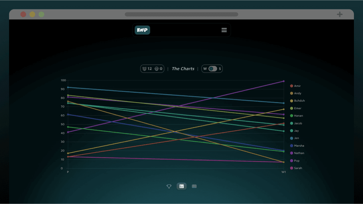
Improving the chart component was another significant update. Instead of manually adjusting the chart each week, I purchased a pre-built, interactive chart component that could be easily updated via a Google Sheet. This decision saved me a considerable amount of time and allowed me to focus on other aspects of the site. It was a lesson in knowing when to leverage existing tools rather than reinventing the wheel.
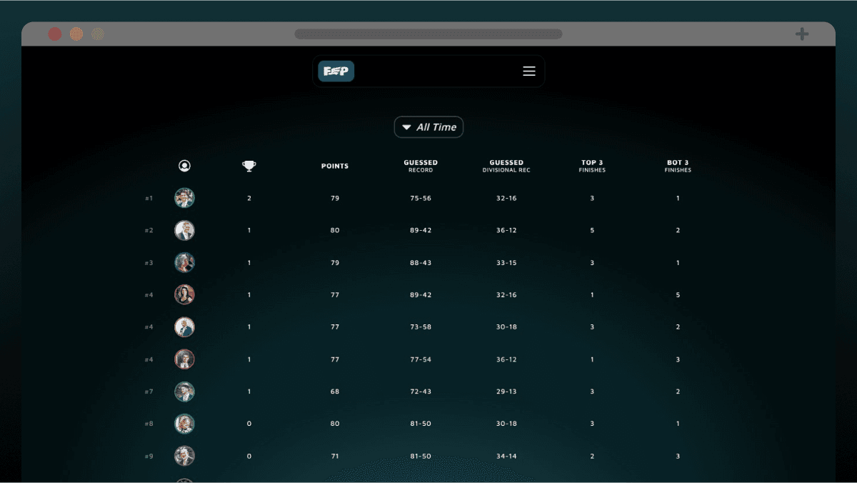
The final major update was the implementation of a new CMS. This overhaul made weekly updates significantly easier by allowing me to manage newsletters, standings, picks, and stats directly from the CMS without having to enter the site editor. Although I'm the only one updating the site, I approached this redesign as if I were handing it off to a client with no prior experience with Framer. The CMS does all the heavy lifting, making the site nearly self-sufficient.
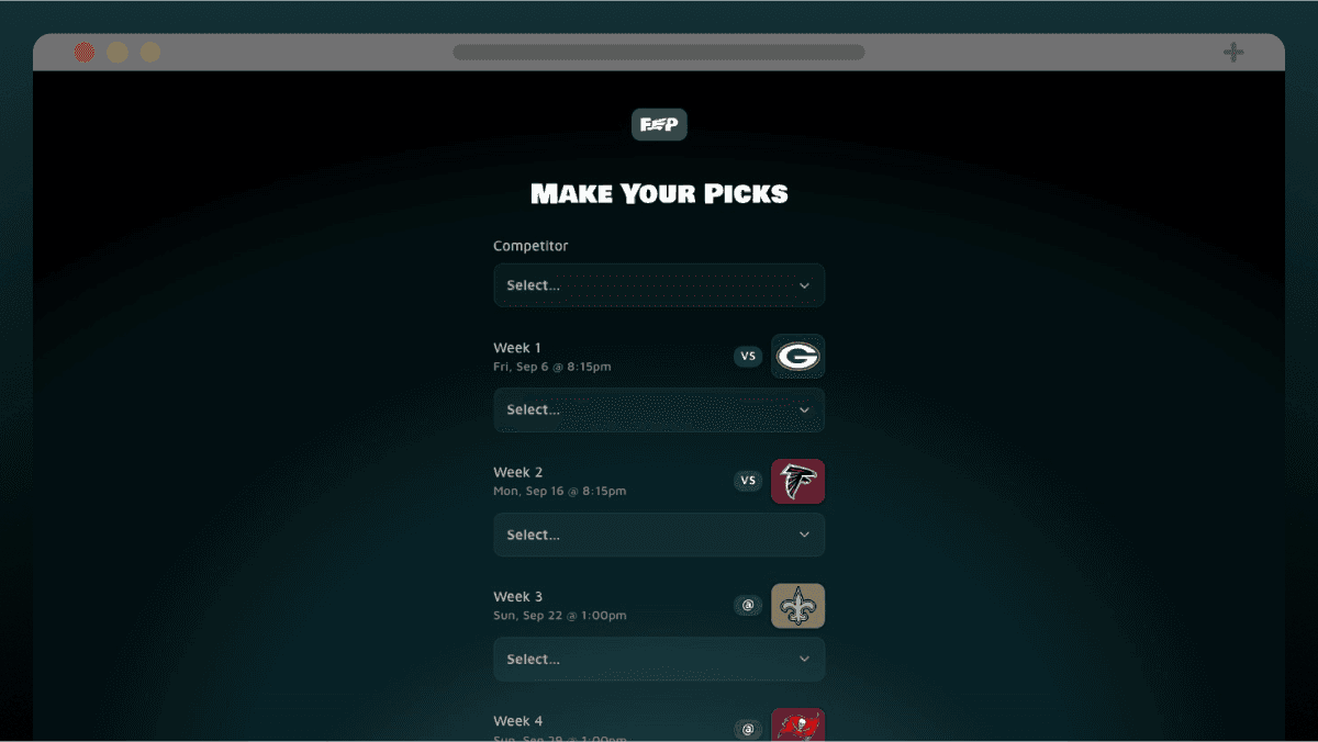
As a fun bonus, I also experimented with Framer's new custom Forms feature to replace the Google Sheet we traditionally used for submitting season picks. The new form turned out great and added another layer of polish to the site.
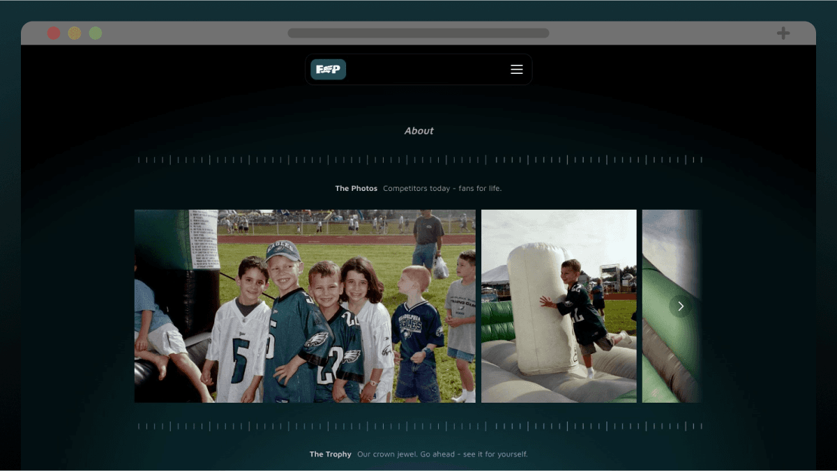
Additional Visuals
The FEP (V2)
JUL 2024
BRAND
DESIGN
SITE
Overview
The Family Eagles Pool (FEP) website is a personal project that I originally built to teach myself Framer. After using the site for a full season, I decided to revamp it to simplify the user experience, integrate new Framer updates, and streamline the back-end processes.
Accomplishments
Revamped the FEP website with a simpler, cleaner design that improved user experience by making all key components easily accessible.
Streamlined the back-end process by integrating a new CMS and purchasing an advanced chart component, significantly reducing the manual workload.
Responsibilities
I took it upon myself to redesign and rebuild the FEP website to make it simpler, cleaner, and more user-friendly. I did 100% of the work myself.
Process
The first version of the FEP site, while a great learning experience, had several shortcomings, including a manual process for updating the chart component and a less-than-robust CMS. My goal for the revamp was to simplify the design, reduce friction for users, and make the site easier to maintain.
I started by simplifying the site's layout, ensuring that all key information—standings, charts, and picks—was visible within the viewport and accessible with a single click. This change made the site more intuitive and user-friendly, allowing competitors to check their standings quickly each week. As a bonus, I played around with Framer's 3D effects update to add some more visual appeal.
Improving the chart component was another significant update. Instead of manually adjusting the chart each week, I purchased a pre-built, interactive chart component that could be easily updated via a Google Sheet. This decision saved me a considerable amount of time and allowed me to focus on other aspects of the site. It was a lesson in knowing when to leverage existing tools rather than reinventing the wheel.
The final major update was the implementation of a new CMS. This overhaul made weekly updates significantly easier by allowing me to manage newsletters, standings, picks, and stats directly from the CMS without having to enter the site editor. Although I'm the only one updating the site, I approached this redesign as if I were handing it off to a client with no prior experience with Framer. The CMS does all the heavy lifting, making the site nearly self-sufficient.
As a fun bonus, I also experimented with Framer's new custom Forms feature to replace the Google Sheet we traditionally used for submitting season picks. The new form turned out great and added another layer of polish to the site.
Additional Visuals