
Arro
SEP 2024 - NOW
BRAND
DESIGN
SITE
Overview
Arro is a fintech startup on a mission to democratize credit and financial literacy for the next generation. They offer a low-interest credit card paired with a gamified app that helps users learn good money habits as they spend and save.
I joined Arro as their Product Design Lead in September 2024, tasked with modernizing and scaling Arro Design. As the sole designer at a $15M startup, I owned everything visual—from mobile app UX to marketing site design, a full brand refresh/consolidation, custom animations, and more. In this role, I pushed for design excellence at every turn, proving that even finance apps can be fun, engaging, and user-centric without sacrificing credibility.
Accomplishments
Led the design function (product, brand, web, marketing) to create a standout, user-friendly fintech app with a seamless customer experience.
Refined Arro’s brand for a younger audience, achieving a Net Promoter Score of 71 and 96% user retention.
Built a scalable design system in Figma, ensuring high-quality design and smooth developer handoff.
Launched a new freemium model that boosted account creation by 17x and drove 70% of new users to take key actions within 2 weeks.
Simplified complex financial concepts into intuitive, engaging user flows, making advanced features accessible and fun.
Awarded "Best Mobile App" of November 2024.
Responsibilities
Design Leadership: As Design Lead, I set the vision for Arro’s product experience and visual identity, managing the entire design process from research to polished UI and prototyping, ensuring consistency across mobile and web. As the sole designer, I bridged product, design, and FE development to bring ideas to life.
Cross-Functional Collaboration: Worked closely with a small team (PM, FE, BE developers) to rapidly iterate on features. Advocated for users while aligning design with product goals, refining interactions, and streamlining handoffs from Figma to code. My proactive communication helped the team deliver polished features quickly.
Product & Brand Stewardship: Owned Arro’s visual brand, refreshed the color palette, and created a design system for product and marketing consistency. Produced assets for the website, landing pages, email templates, and pitch decks to ensure Arro’s brand was unified and engaging.
Process
Balancing Vision with Constraints (Rapid Iteration)
In a fast-paced startup environment, I've learned how to constantly balance ideal design vision with real-world constraints. We followed an iterative approach: I’d sketch out big ideas and high-fidelity mocks for a feature, but we’d often scope an MVP that the engineers could build in a week or two. I was deeply involved in prioritizing which polish details were must-haves and which could be phased in later. This mindset helped us avoid getting stuck on perfection and instead release improvements continuously.

For example, when designing our new Insights dashboard, I was focused on creating a dynamic, visually appealing dashboard that used brand new components from my updated design system; due to time and resource constraints, I pared it down to a much simpler version that still delivered the key value but used existing components and cut down the scope.
I have a strong belief that design should not be the bottleneck at a small startup like Arro. If engineering provides feedback that certain elements will add multiple hours to their effort, I almost always will swiftly iterate to accommodate. There can't be ego on such a small team. By collaborating closely and being pragmatic, I ensured that our design quality remained high even as we moved at startup speed. We've rolled out dozens of enhancements this way—including our first freemium model that we launched in under two months—each time refining the product without ever stalling development
Improving Engineering Handoff with Figma
Given our lean team, I put a big emphasis on making the design-to-development handoff super efficient. In Figma, I organized our files with clear page structures, flow diagrams, and annotations that documented changes to existing screens, fine design details, and more.
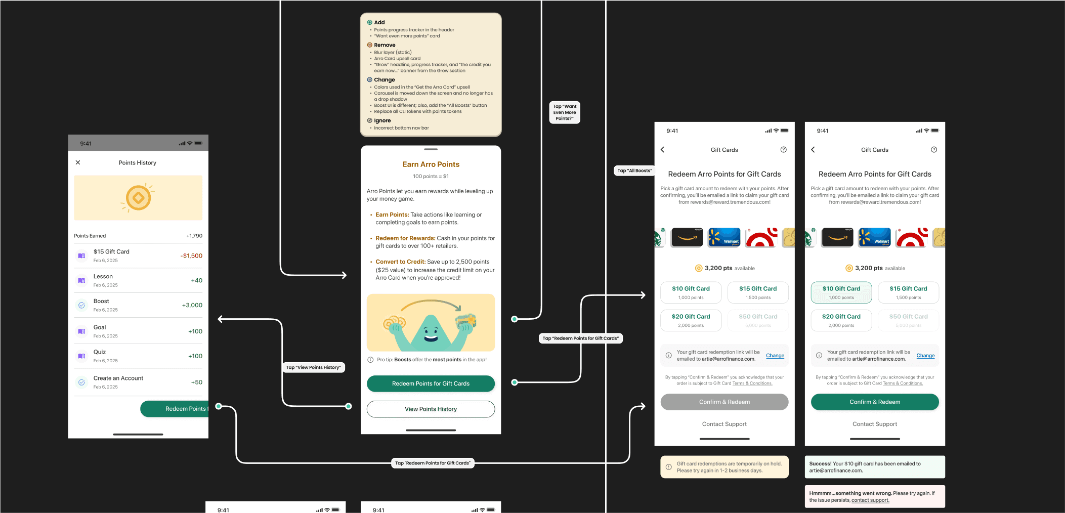
I led scoping sessions with our engineering team where I walked through the latest Figma designs, gathered technical feedback, and ensured alignment from all stakeholders. By establishing this tight feedback loop, we dramatically reduced back-and-forth once implementation began. The outcome was that our UI builds were pixel-perfect more often than not, and engineers reported that implementing my designs was straightforward. This efficient handoff process saved time and helped us ship polished features faster, even with a small team.
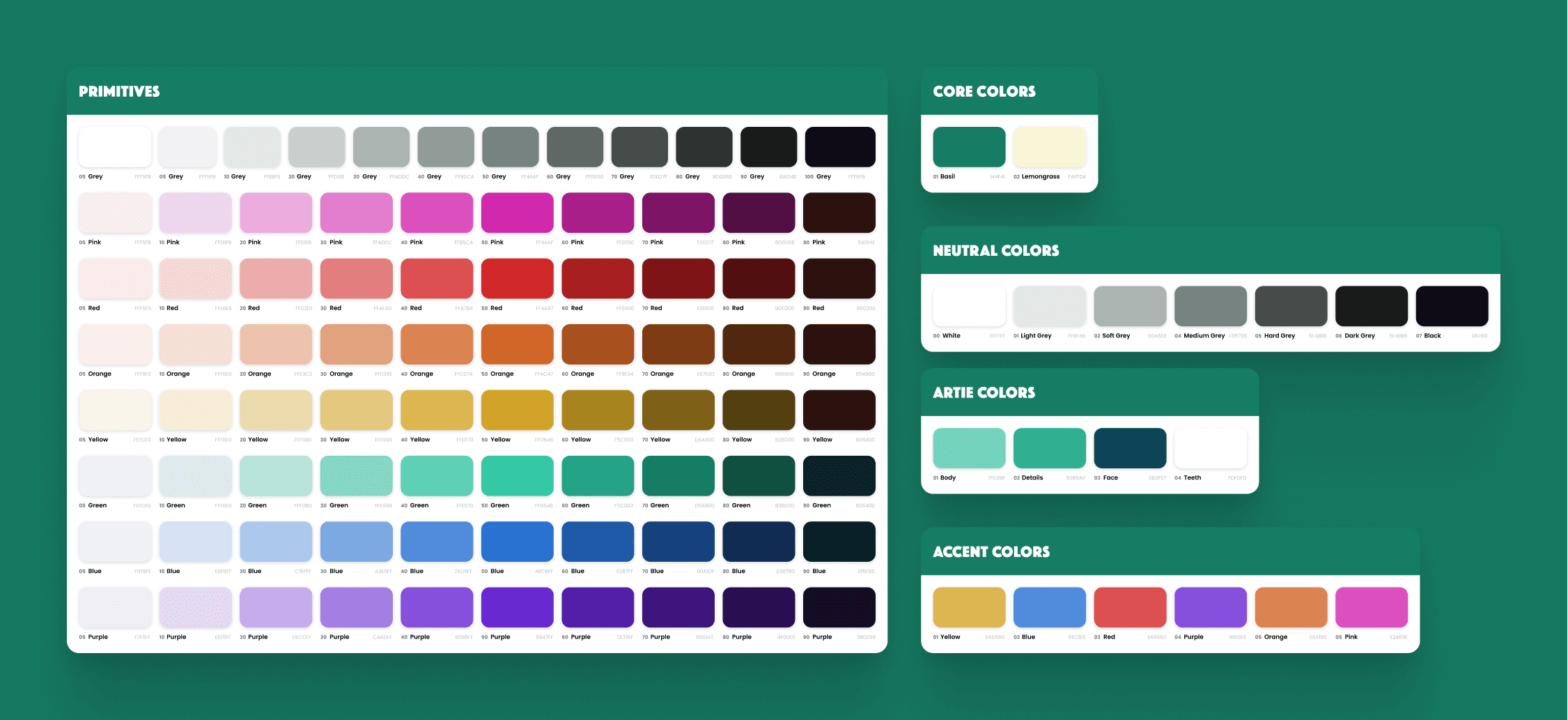
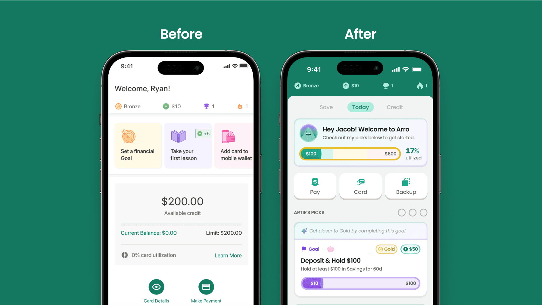
Establishing a Scalable Design System
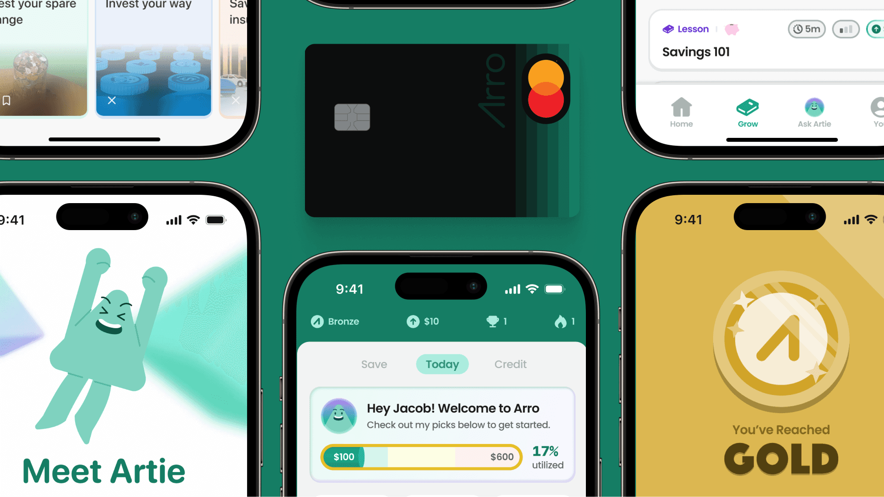
To maintain consistency as the product grew, I created a refreshed design system from scratch. (Note: we're still in the process of implementing this new design system in the app, but its elements can be seen in all other verticals). Arro previously had a design system, but it was outdated, ineffective, and completely unorganized. I rolled up our new color scheme, typography choices, and UI components into a Figma library that could be used across the mobile app and web. This included custom, reusable components that were designed and built alongside our FE devs. The result was a cohesive experience where all Arro products felt like a part of the same modern family, and new features can be designed and prototyped in hours instead of days.
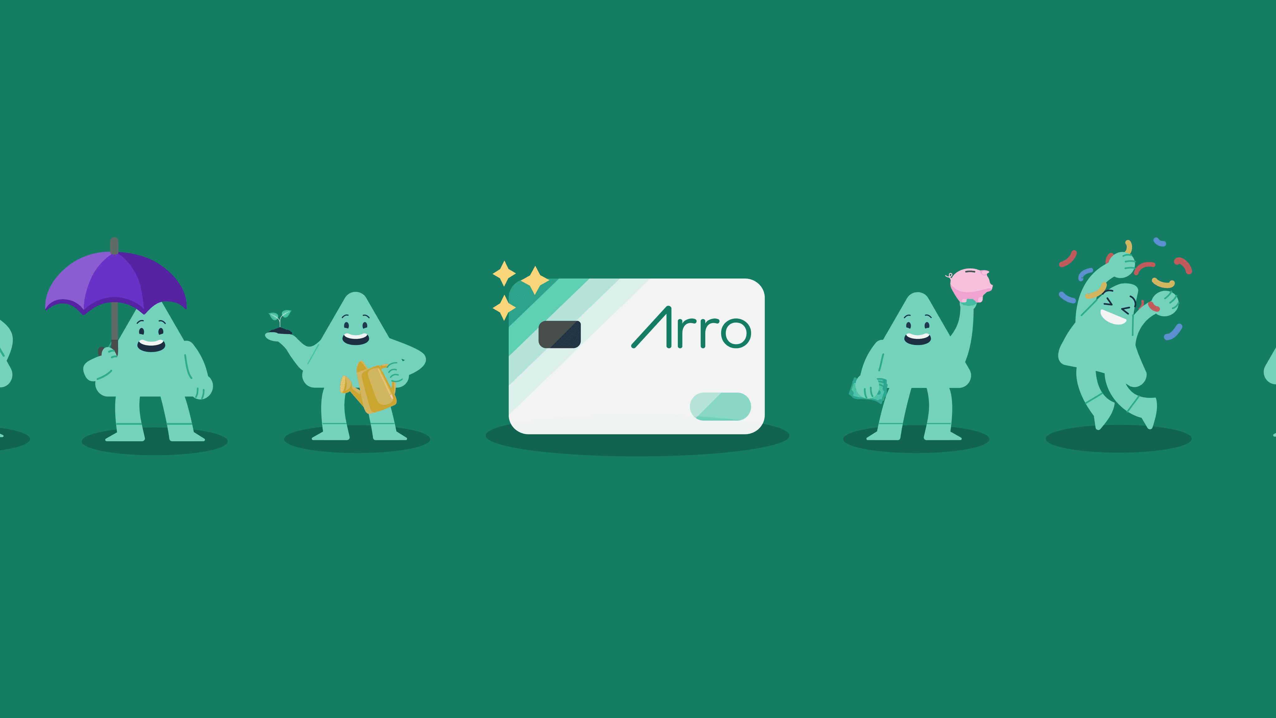
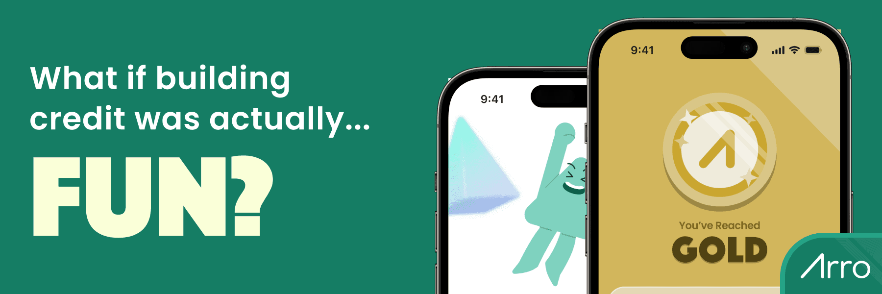
Adding Personality with Artie & Delightful Animations
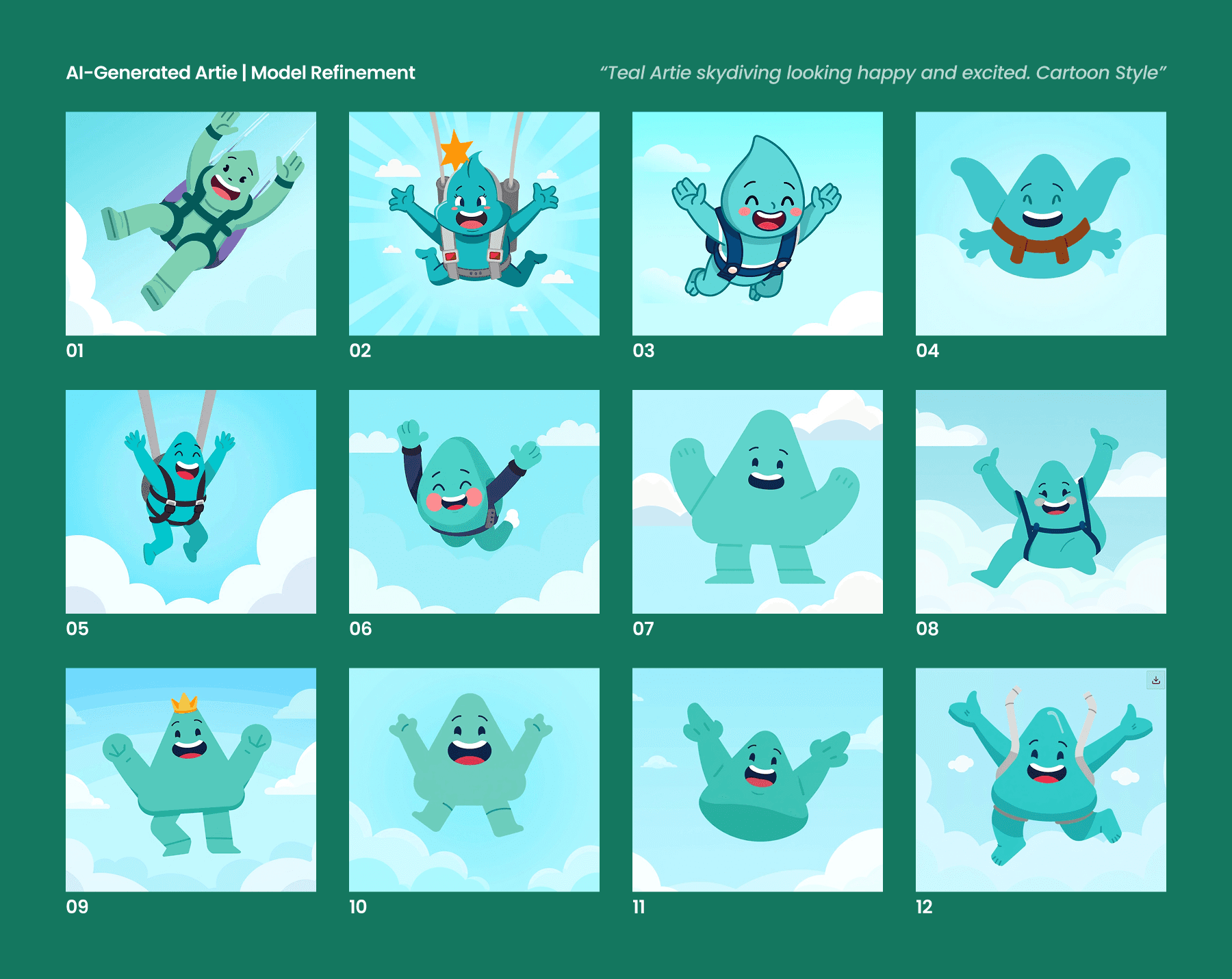
One of my favorite additions was Artie, our new AI money coach mascot. To be fair, I didn't invent Artie, but I greatly expanded his scope throughout the app.
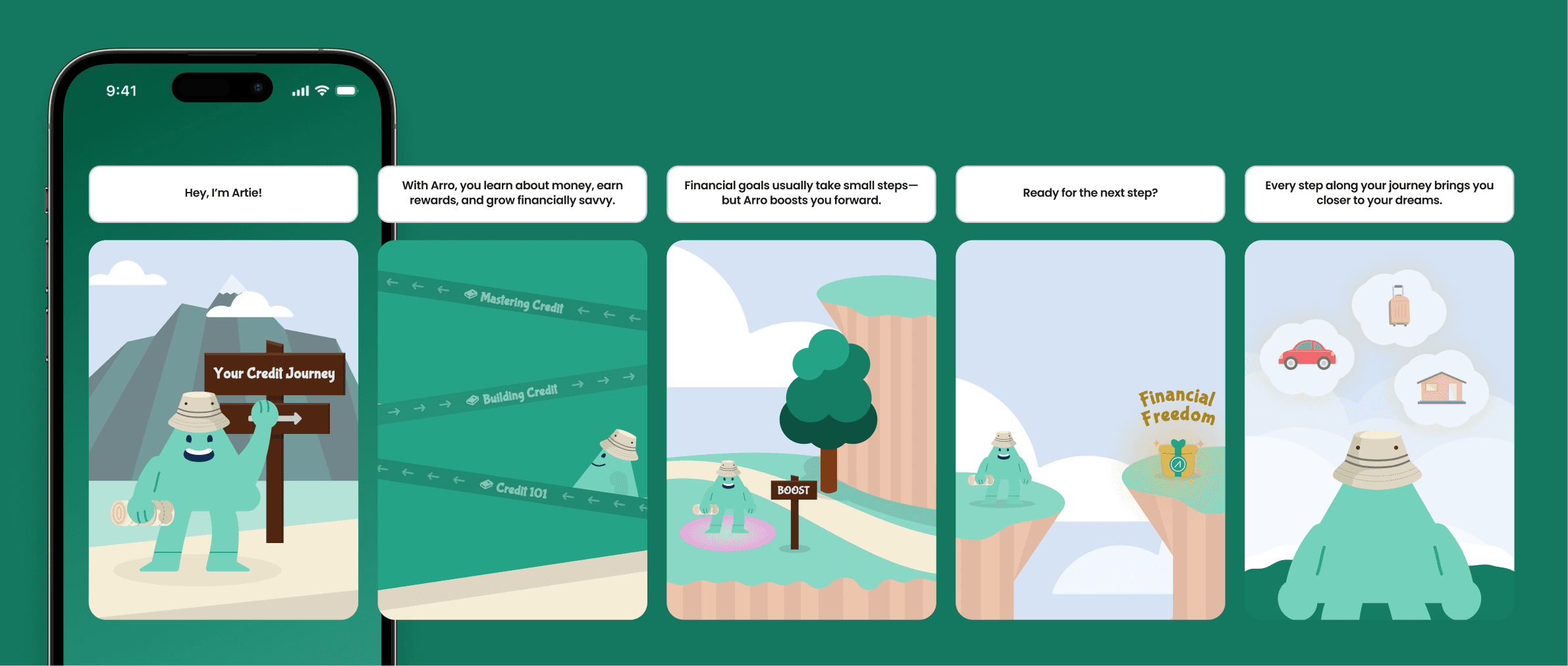
I worked with the team to better personify Artie, iterating through various custom GPT versions to nail his personality. I also had a mission to weave in Artie more throughout the app. I designed custom Lottie animations for moments of achievement – like leveling up your credit or completing an education quiz – to celebrate the user’s progress in a delightful way. I also worked closely with one of our engineers to create an Artie image generator, which would both save me design time and enable many more moments of personalized Artie images throughout the app. These little touches of motion and personality turn what could be dry financial tasks into something game-like and enjoyable.
Artie became the quirky sidekick of the user’s journey, injecting humor and warmth while still providing real help (like nudging users on upcoming payments or answering FAQs). By adding this layer of humanized interaction, we saw users coming back more often and engaging more deeply with the educational features. It proved that fintech can have a bit of fun!
Rebuilding the Arro Website
When I arrived, Arro’s marketing site had a traditional fintech feel: lots of text, a corporate tone, and a straightforward but uninspiring layout. It conveyed information but didn’t connect with younger users emotionally. I kicked off the redesign by auditing the content and gathering feedback—the consensus was that the site needed more life, clarity of value props, and a modern aesthetic to attract more Gen-Z visitors. I mapped out a new information architecture, simplified the sign-up flow on the site, and drew up wireframes focusing on storytelling rather than just facts.
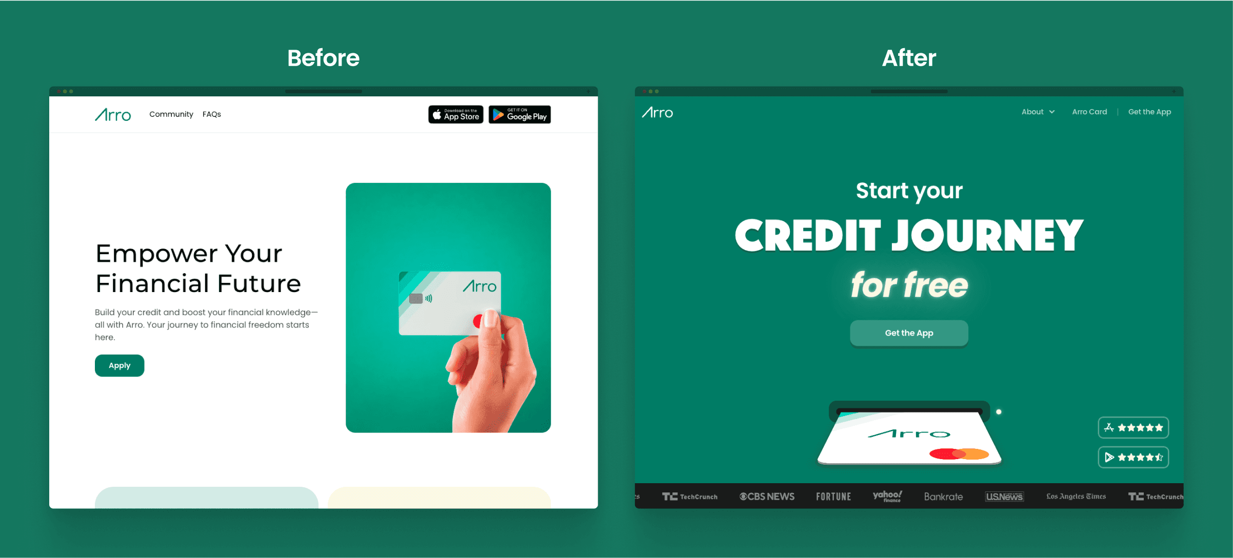
The new website experience—all built in Framer by me—is dynamic and engaging (and still a WIP). I introduced bold visuals, easy-to-scan sections, and a conversational copy style.
Instead of stock photos, the site showcases playful custom illustrations and interactive elements that draw users in. I embedded testimonials from happy young customers and highlighted tangible milestones to build trust.
The UI went from flat and serious to lively and inviting–complete with pops of Arro’s fresh color palette and subtle animations as you scroll. This rebuild not only better explains Arro’s value (in plain language), but it also makes a strong first impression that this isn’t your boring traditional credit card.
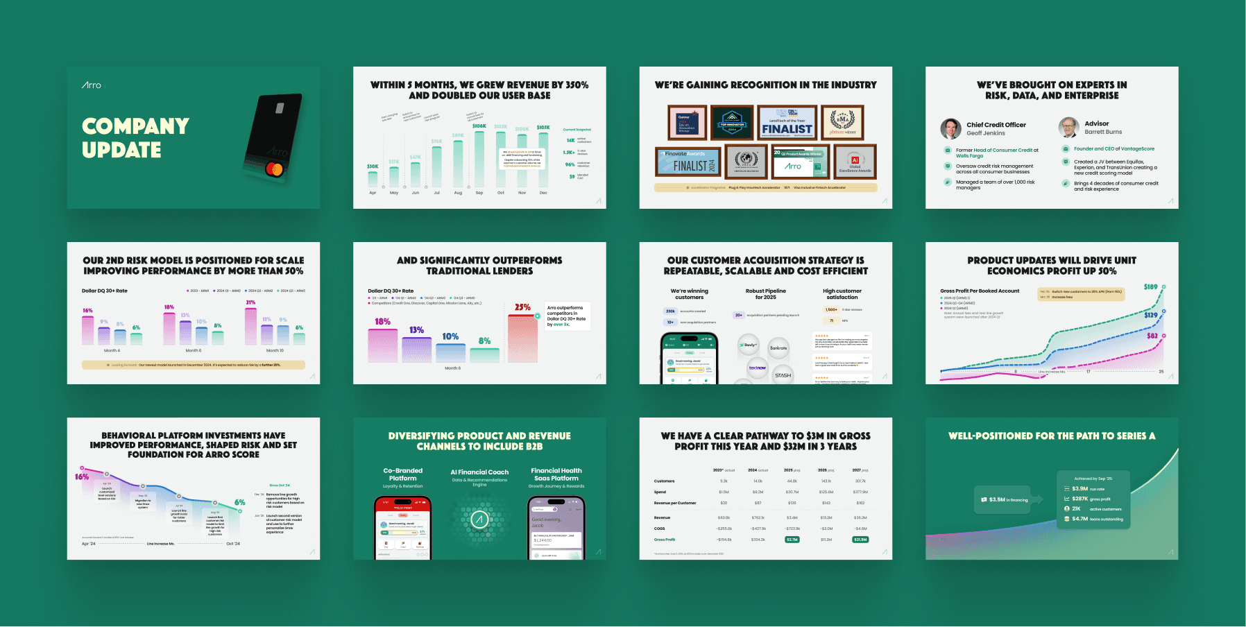
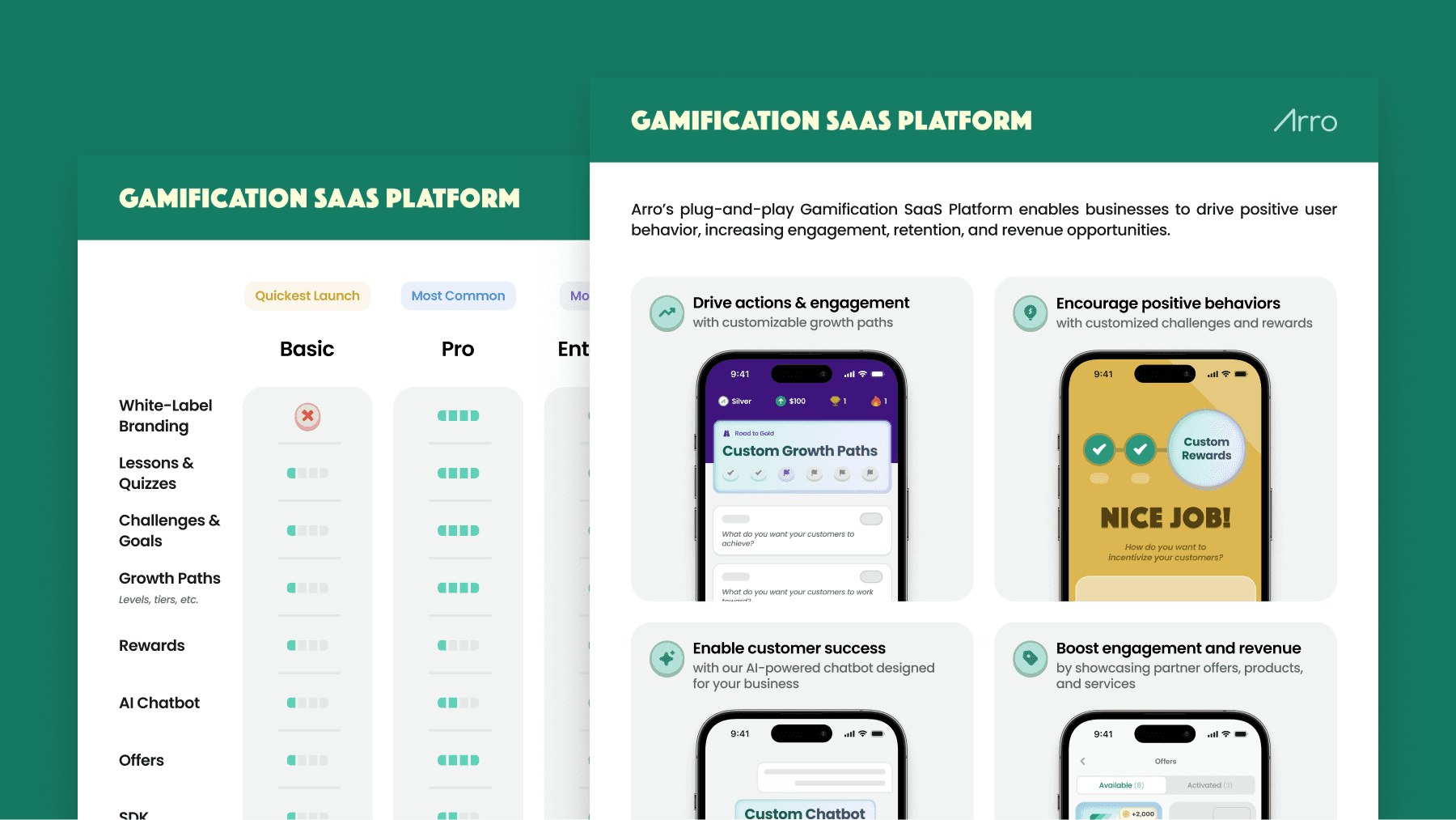
Additional Visuals

Arro
SEP 2024 - NOW
BRAND
DESIGN
SITE
Overview
Arro is a fintech startup on a mission to democratize credit and financial literacy for the next generation. They offer a low-interest credit card paired with a gamified app that helps users learn good money habits as they spend and save.
I joined Arro as their Product Design Lead in September 2024, tasked with modernizing and scaling Arro Design. As the sole designer at a $15M startup, I owned everything visual—from mobile app UX to marketing site design, a full brand refresh/consolidation, custom animations, and more. In this role, I pushed for design excellence at every turn, proving that even finance apps can be fun, engaging, and user-centric without sacrificing credibility.
Accomplishments
Led the design function (product, brand, web, marketing) to create a standout, user-friendly fintech app with a seamless customer experience.
Refined Arro’s brand for a younger audience, achieving a Net Promoter Score of 71 and 96% user retention.
Built a scalable design system in Figma, ensuring high-quality design and smooth developer handoff.
Launched a new freemium model that boosted account creation by 17x and drove 70% of new users to take key actions within 2 weeks.
Simplified complex financial concepts into intuitive, engaging user flows, making advanced features accessible and fun.
Awarded "Best Mobile App" of November 2024.
Responsibilities
Design Leadership: As Design Lead, I set the vision for Arro’s product experience and visual identity, managing the entire design process from research to polished UI and prototyping, ensuring consistency across mobile and web. As the sole designer, I bridged product, design, and FE development to bring ideas to life.
Cross-Functional Collaboration: Worked closely with a small team (PM, FE, BE developers) to rapidly iterate on features. Advocated for users while aligning design with product goals, refining interactions, and streamlining handoffs from Figma to code. My proactive communication helped the team deliver polished features quickly.
Product & Brand Stewardship: Owned Arro’s visual brand, refreshed the color palette, and created a design system for product and marketing consistency. Produced assets for the website, landing pages, email templates, and pitch decks to ensure Arro’s brand was unified and engaging.
Process
Balancing Vision with Constraints (Rapid Iteration)
In a fast-paced startup environment, I've learned how to constantly balance ideal design vision with real-world constraints. We followed an iterative approach: I’d sketch out big ideas and high-fidelity mocks for a feature, but we’d often scope an MVP that the engineers could build in a week or two. I was deeply involved in prioritizing which polish details were must-haves and which could be phased in later. This mindset helped us avoid getting stuck on perfection and instead release improvements continuously.
For example, when designing our new Insights dashboard, I was focused on creating a dynamic, visually appealing dashboard that used brand new components from my updated design system; due to time and resource constraints, I pared it down to a much simpler version that still delivered the key value but used existing components and cut down the scope.
I have a strong belief that design should not be the bottleneck at a small startup like Arro. If engineering provides feedback that certain elements will add multiple hours to their effort, I almost always will swiftly iterate to accommodate. There can't be ego on such a small team. By collaborating closely and being pragmatic, I ensured that our design quality remained high even as we moved at startup speed. We've rolled out dozens of enhancements this way—including our first freemium model that we launched in under two months—each time refining the product without ever stalling development
Improving Engineering Handoff with Figma
Given our lean team, I put a big emphasis on making the design-to-development handoff super efficient. In Figma, I organized our files with clear page structures, flow diagrams, and annotations that documented changes to existing screens, fine design details, and more.
I led scoping sessions with our engineering team where I walked through the latest Figma designs, gathered technical feedback, and ensured alignment from all stakeholders. By establishing this tight feedback loop, we dramatically reduced back-and-forth once implementation began. The outcome was that our UI builds were pixel-perfect more often than not, and engineers reported that implementing my designs was straightforward. This efficient handoff process saved time and helped us ship polished features faster, even with a small team.
Establishing a Scalable Design System
To maintain consistency as the product grew, I created a refreshed design system from scratch. (Note: we're still in the process of implementing this new design system in the app, but its elements can be seen in all other verticals). Arro previously had a design system, but it was outdated, ineffective, and completely unorganized. I rolled up our new color scheme, typography choices, and UI components into a Figma library that could be used across the mobile app and web. This included custom, reusable components that were designed and built alongside our FE devs. The result was a cohesive experience where all Arro products felt like a part of the same modern family, and new features can be designed and prototyped in hours instead of days.
Adding Personality with Artie & Delightful Animations
One of my favorite additions was Artie, our new AI money coach mascot. To be fair, I didn't invent Artie, but I greatly expanded his scope throughout the app.
I worked with the team to better personify Artie, iterating through various custom GPT versions to nail his personality. I also had a mission to weave in Artie more throughout the app. I designed custom Lottie animations for moments of achievement – like leveling up your credit or completing an education quiz – to celebrate the user’s progress in a delightful way. I also worked closely with one of our engineers to create an Artie image generator, which would both save me design time and enable many more moments of personalized Artie images throughout the app. These little touches of motion and personality turn what could be dry financial tasks into something game-like and enjoyable.
Artie became the quirky sidekick of the user’s journey, injecting humor and warmth while still providing real help (like nudging users on upcoming payments or answering FAQs). By adding this layer of humanized interaction, we saw users coming back more often and engaging more deeply with the educational features. It proved that fintech can have a bit of fun!
Rebuilding the Arro Website
When I arrived, Arro’s marketing site had a traditional fintech feel: lots of text, a corporate tone, and a straightforward but uninspiring layout. It conveyed information but didn’t connect with younger users emotionally. I kicked off the redesign by auditing the content and gathering feedback—the consensus was that the site needed more life, clarity of value props, and a modern aesthetic to attract more Gen-Z visitors. I mapped out a new information architecture, simplified the sign-up flow on the site, and drew up wireframes focusing on storytelling rather than just facts.
The new website experience—all built in Framer by me—is dynamic and engaging (and still a WIP). I introduced bold visuals, easy-to-scan sections, and a conversational copy style.
Instead of stock photos, the site showcases playful custom illustrations and interactive elements that draw users in. I embedded testimonials from happy young customers and highlighted tangible milestones to build trust.
The UI went from flat and serious to lively and inviting–complete with pops of Arro’s fresh color palette and subtle animations as you scroll. This rebuild not only better explains Arro’s value (in plain language), but it also makes a strong first impression that this isn’t your boring traditional credit card.
Additional Visuals